227
Risk Management VaR — daily, MM
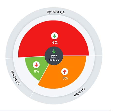
Rates US›Credit›Extreme Moves
Breach #D0342C
Warning #E6A700
Within limit #2F7D4F
Selected #2F6BD0
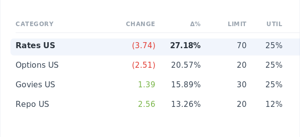
14
levels of hierarchy, one starting view
A visual language for risk that had to make sense to two people at once — the analyst fourteen levels deep, and the executive who just needs to know what's on fire.
Credit Suisse was running daily risk analysis across trading desks, portfolios and business lines. The numbers existed — but they lived in disconnected systems, and there was no single place to see the whole picture. Reviews dragged. Breaches could hide.
The hard part wasn't the data. It was that the same data had to serve two opposite minds — analysts tracing a position down fourteen levels, and managers who just want the headline.
How do you give both a single source of truth?
The answer was progressive disclosure — surface the summary, and reveal depth only when it's asked for. Pick an entity in one wheel and the next recalculates around it: Rates US, then Credit, then Extreme Moves.
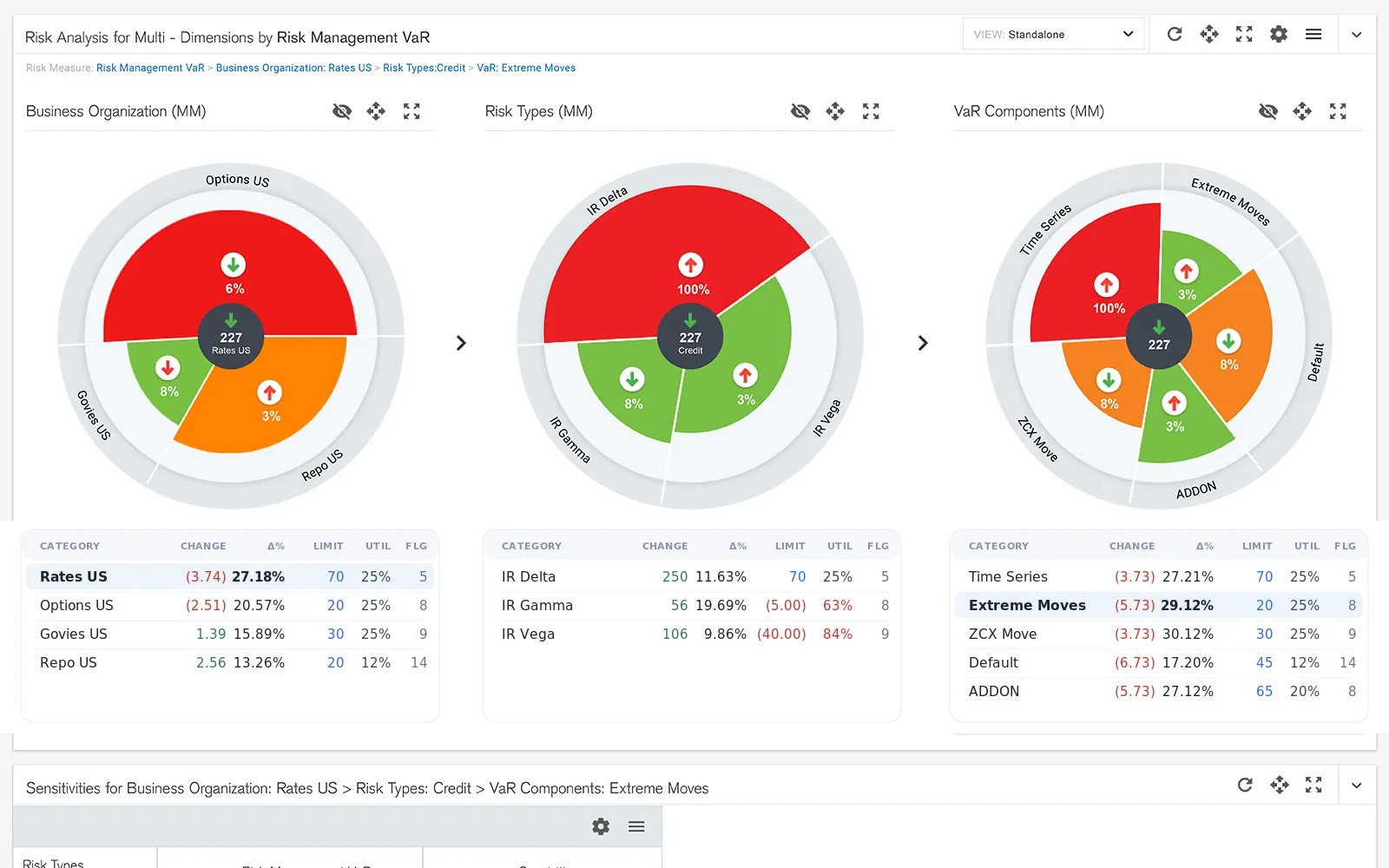
Live figures render through D3.js, E-Charts and Highcharts, unified into one consistent visual language — and a small, deliberate colour system does the quiet work of flagging what matters.

The dashboard pulled fragmented risk into one navigable place — faster reviews, fewer missed breaches, and a component library that set the standard for the dashboards that came after it.
Reveal depth on demand — not everything, not nothing.